Dr. Bradley’s RX

-
Dr. Bradley Frederick is a chiropractor and sports medicine doctor in Beverly Hills. His practice, which uses cutting edge technology as well as novel technique and methodology has become a sought-after pain management clinic for those living with chronic pain who are looking at major surgery as their only solution. The Studio worked with Dr. Frederick and his team in the launch of his new product line called Dr. Bradley’s RX- a doctor-formulated pain solution that uses proprietary technology to act faster, last longer and deliver sustained relief to patients offering an all-natural alternative to the standard over the counter treatment options. The idea behind Dr. Bradley's RX came directly from patient experience and feedback. Patients shared with Dr. Frederick the benefits they were getting from CBD products that complemented their therapeutic work at his clinic. It was this insight and the realization that there was a clear deficit in the topical CBD remedies available that led to the 4-year process that yielded the Dr. Bradley’s RX brand and product line.
-
The Studio worked with the team at Dr. Bradley’s RX to hone in on a coherent understanding of the product, the need for its development, and the incredible resilience and fortitude that had led to its ultimate creation. One of the goals of the product was to reach more people in need of pain solutions who would not get the opportunity to visit Dr. Frederick’s renowned clinic for themselves. This product line expanded the doctors reach, allowing him to provide relief to a much larger audience. The challenge was that the office was not used to the removed relationship implicit in an online e-commerce consumer- this was immediately evident in the product messaging which lacked consistency and tended to confuse and overwhelm instead of clarify and distill.
-
Description text goes here
“We're in the business of helping people, giving them unique products that are all-natural, have minimal side effects, and do what they're supposed to do.”
-DR. BRADLEY FREDERICK

New Product Labeling using matte sticker in original box designed by The Wonderful Company
The visual identity design of the brand started years ago with the packaging, which was created and executed by The Wonderful Company in line with the brand’s luxury market price point. The sleek black box that monochrome palette spoke to an affluent target market already knowledgeable about the benefits of CBD topicals and other alternative pain-relief remedies. The packaging had to meet the expectations this demographic would have for product experience and packaging design hence the attention to detail and bold aesthetic choices including embossed, silver lettering a transparent packaging insert with a note from the doctor and his handwritten signature- a personal, lovely touch.

Old Product Labeling designed by the Wonderful Company
We knew the packaging would not change as everything had been made to order and manufactured, however, the product photography shoot early on brought with it the issue that CBD could not be used on the box if they wanted to advertise anywhere on the internet, so a sleeve was devised and we effectively renamed the products to match their new identities: Nano 40 CBD Serum became Nano 40 Pain Serum and Nano 40 CBD Concentrate became Nano 40 Pain Concentrate.
Visual identity is not about "selling design ideas"- this is subjective & arbitrary- but rather a way to solve the pain points you are facing in your business through a strategic visual system.

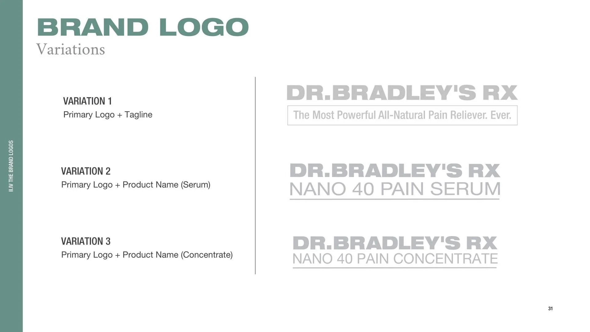

Existing Brand Identity
The aesthetic elements of a brand must be functional- each visual piece works in service of the larger business goals and the core principles that drive decisions and guide the company forward.
Working closely with my incredible graphic designer, we immediately saw a disconnect between the brands personality (wellness-oriented, holistic medicine, all-natural, etc.) and the packaging that dictated the existing color scheme of dark grey, silver, and orange. My graphic designer immediately raised this issue and although we went through several iterations to present to the client, we were clear in our reasoning as to why we needed to go in a different direction and soften up the palette.
It is always a complex creative challenge to make a color palette that is flexible, consistent, and complementary when you have fixed variables such as bold packaging- the colors of which cannot be changed and must be incorporated into a workable scheme. Juana was able to do this masterfully by creating a palette of accent colors that spoke to our target audience and portrayed our central brand message of wellness without excluding the existing packaging that was built into the brand’s identity.
The New Visual Identity for the Brand

REVISED STYLE GUIDE FOR DR. BRADLEY’S RX


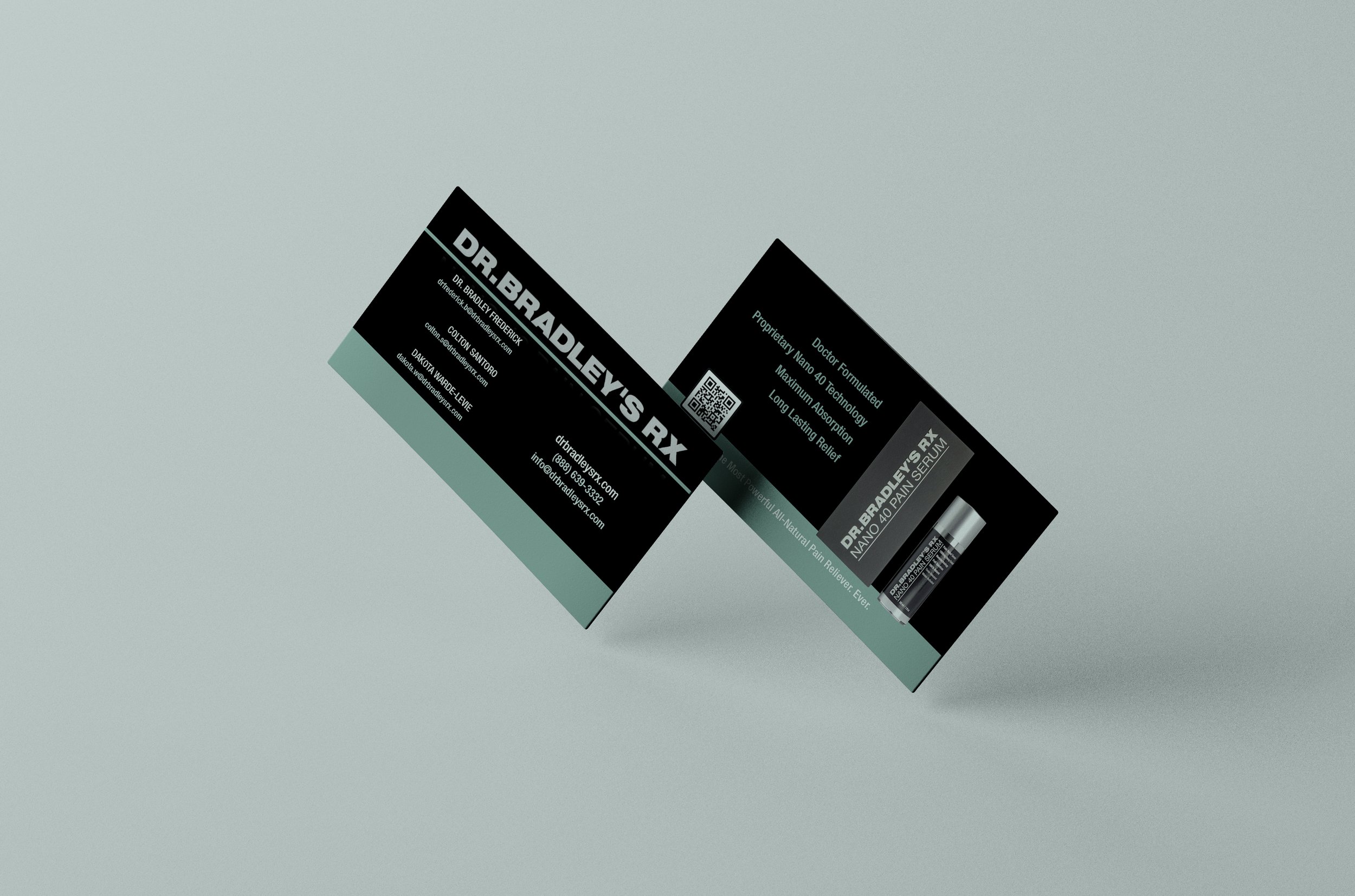


EXPO ASSETS (ABOVE) AND INSTAGRAM REELS (BELOW)
