PULSE
-
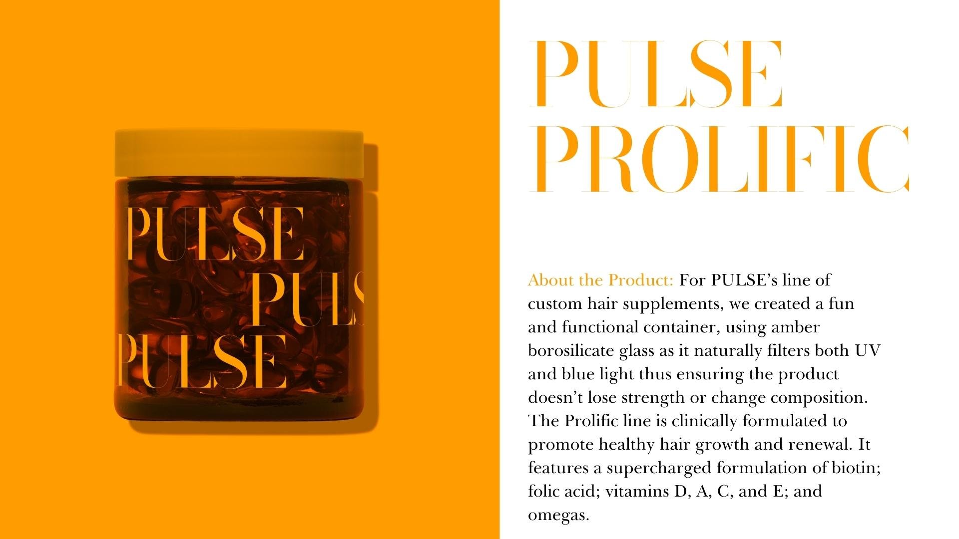
At the Studio, I love working with clients in the wellness space because the benchmark for branding is so high- intuitive brand identity is a non-negotiable. It’s also an opportunity to get back to my roots in the start-up world and work with founders to build out a robust and integrated brand identity that executes strategically and consistently. PULSE’s brand identity is all about visual dynamism and changing the stereotypical aesthetic associated with wellness products, namely subtle, muted color palettes. The founders wanted the brand to showcase a different approach to wellness and self-care- one that had an outgoing personality and vibrancy.
-
The Studio designed a packaging experience that would delight and inspire customers and reflect the extensive R&D effort behind the formulations that resulted in each of the product lines. We wanted the line to be visually clean and because the details of each routine are extensively outlined elsewhere for the end user, we created a more holistic, visually-focused product experience that reflected the brand in a variety of unconventional ways.
-
We wanted to create a fun, vibey campaign that didn’t take itself too seriously, while still messaging the intention & effort behind each product formulation. The brand colors we chose offer flexibility in creating content that is grounding yet playful.


